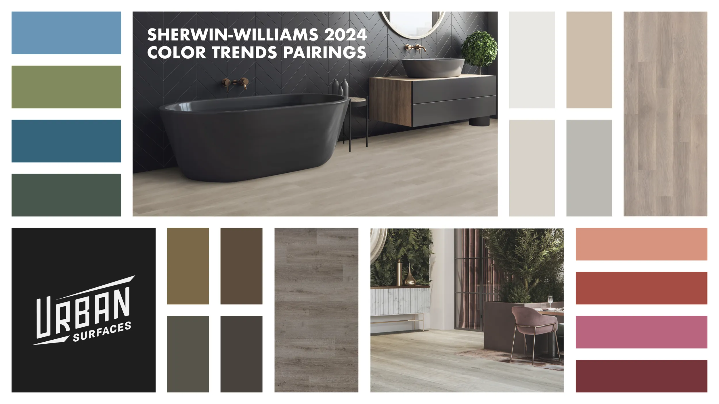
Sherwin-Williams recently released Anthology: Volume One, the first of what will be a biennial report of upcoming color trends. Predicting the tidal flow of interior design trends is a challenging task that few are truly capable of achieving, but Sherwin-Williams and their Director of Color Marketing, Sue Wadden, are an indisputably reliable source in that space.
“These color trends are poised to play a significant role in tomorrow’s designs. From blues and greens to delicate tints, the leading shades of Anthology: Volume One are setting the color direction as we move into a new era of trend reporting.”
-Sue Wadden, Sherwin-Williams Director of Color Marketing
You’d be hard-pressed to describe the four palettes of Anthology: Volume One as anything short of gorgeous. At Urban Surfaces, we are experts in naturalistic beauty and the colors that people find most inviting, so we’ll be showing our appreciation of these palettes by suggesting pairings with our ever-innovative flooring designs.
No. 1 Blues & Greens
“This palette revolves around the color connection between blues and greens, shared across a range of organic, calming-yet-invigorating hues.”
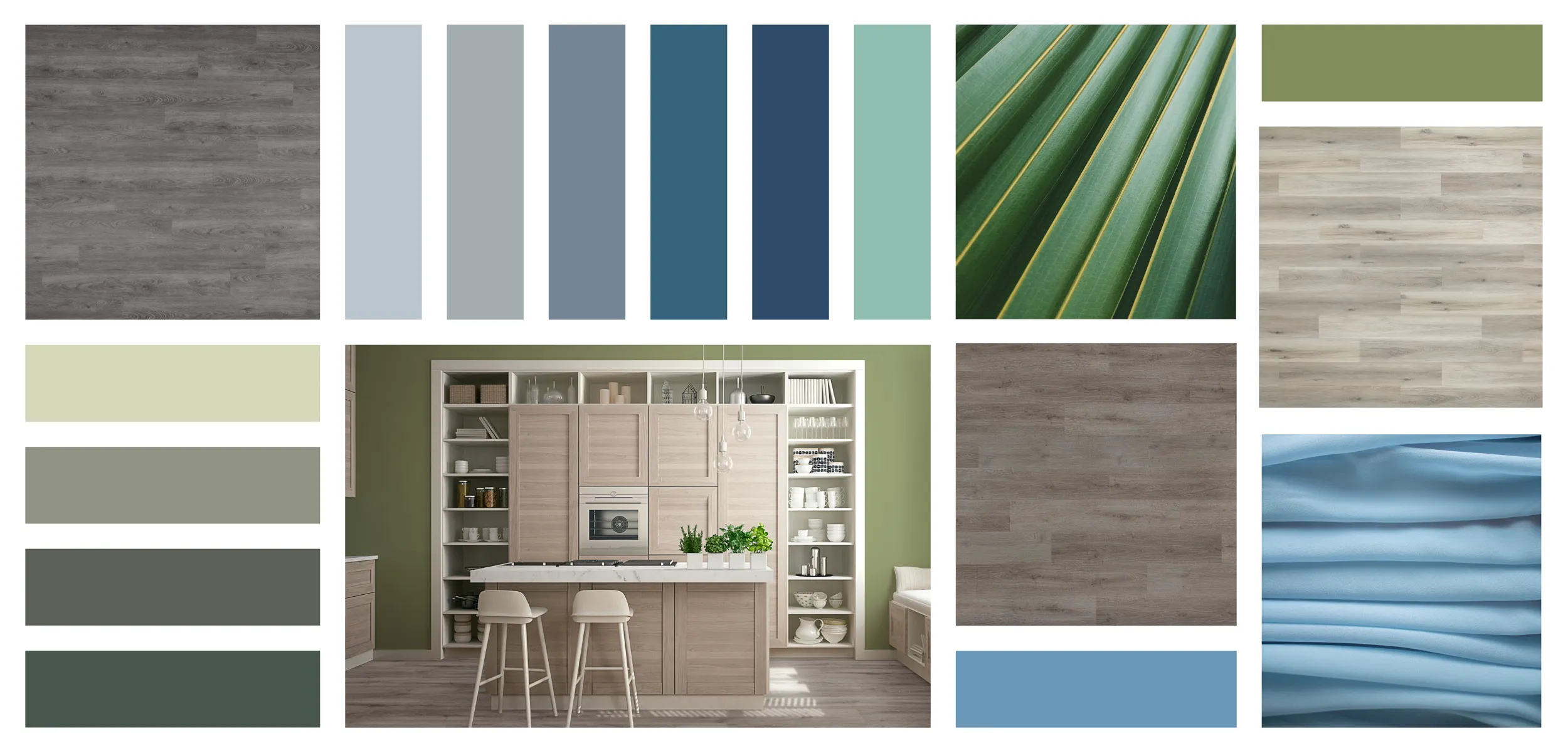
The colors of No. 1 are arboreal and oceanic, providing a rejuvenating environment. While all four palettes are great for biophilic design, No. 1 is biophilic perfection.
For No. 1 Blues & Greens, we recommend these pairings…
Pearl – Studio 12 GlueDown 2101 and Floating Floor 2901
Imitating the iridescence found throughout nature without being extravagant, Pearl is marble-like. This look gracefully walks the line between the natural traits of wood and rock, shore and sea.
Twilight – Main Street 8051 and Sound-Tec 9505
Twilight evokes the feelings of refreshing night air and the aroma of dew-covered flora. The soft scattering of lighter tints and balanced aesthetic will uplift a space without overpowering it.
Pismo – InstaGrip 28 LooseLay 1003
The noonday sun brings warmth, brightness, and only a hint of shadow. Channeling the hues of Central California beach sand, the range of medium and light browns gives Pismo a warm wood aesthetic.
No. 2 Reds & Purples
“Get creative with this palette of reds and purples made for maximalism – a group of warm, saturated hues paired with understated neutrals.”
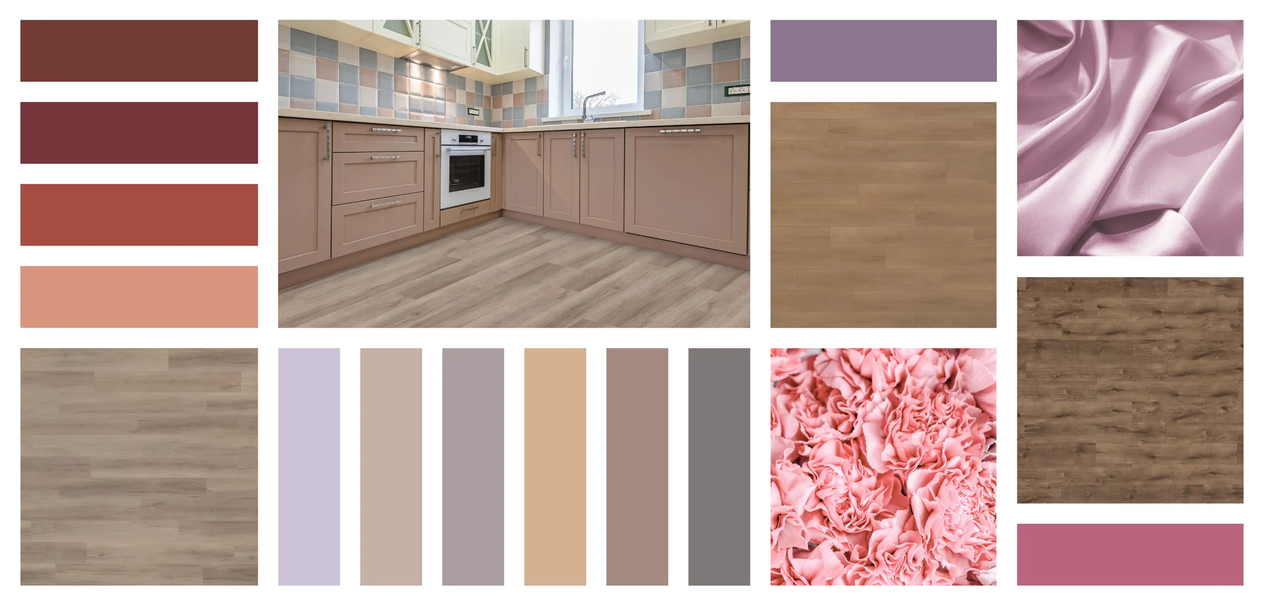
No. 2’s colors are vivacious, flavorful, and royal, creating a space that feels luxurious. This palette is arguably the most daring with several floral hues.
For No. 2 Reds & Purples, we recommend these pairings…
Marquette – Main Street 8061
This is your day, and every step feels lighter. With its light grey undertones, Marquette is a sophisticated and modern take on a classic look, blending nicely in homes, offices, and high-traffic areas.
Chestnut – Studio 12 GlueDown 2106 and Floating Floor 2906
Chestnut is a vintage treasure capturing all the beauty and charm of the great American tree with rustic, brown hues that warm the spirit.
Pinnacle Grove – Sound-Tec Plus 9715
The beauty of the woods seems to stretch on forever. With its rustic but fresh presence, Pinnacle Grove conjures up images of a dense mahogany forest. The muted grain of this design suggests a light fog rolling through.
No. 3 Deeps & Darks
“Escape into a restful retreat with this palette of deep, dark colors. A range of dramatic hues that introduce powerful contrast and a little mystery.”
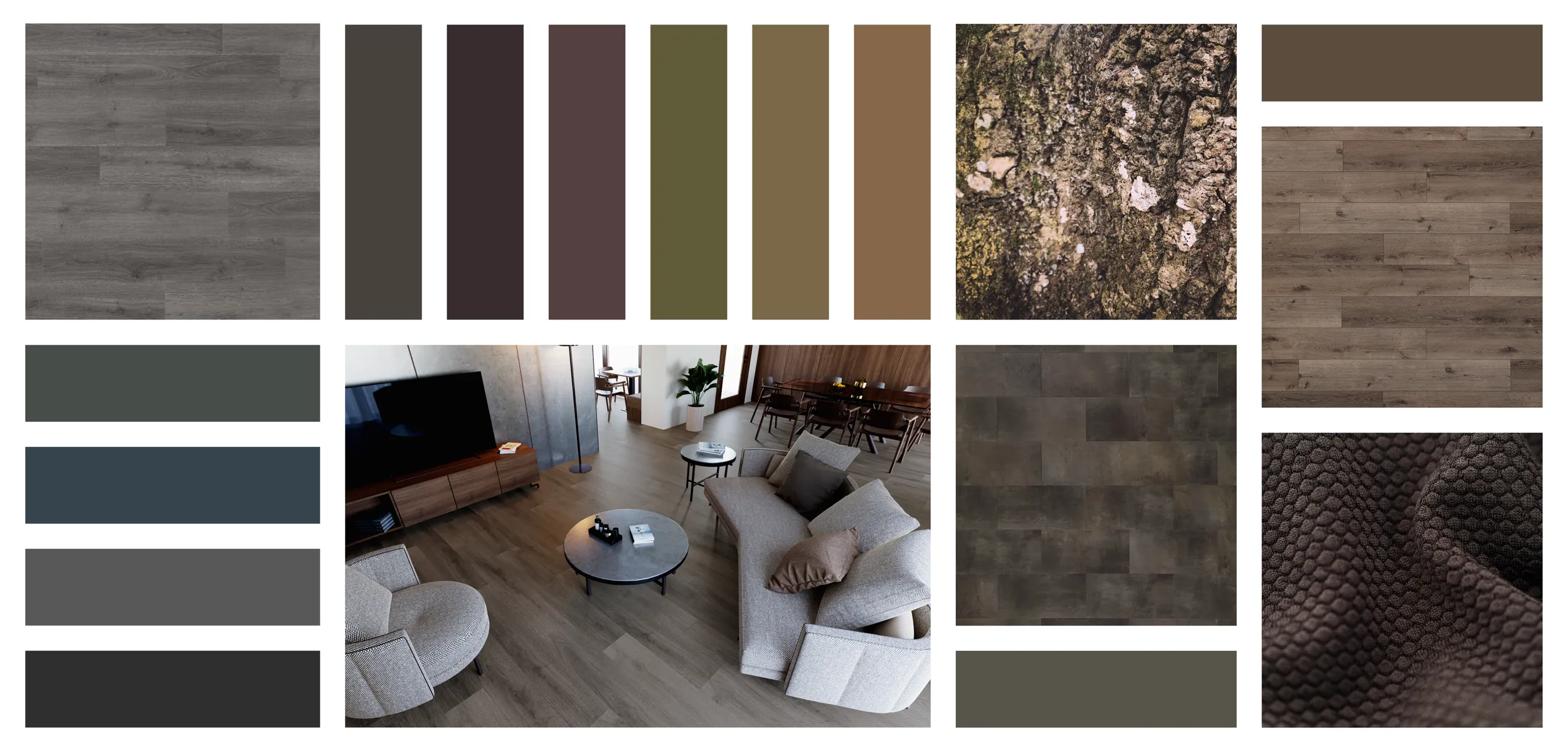
Earthy and autumnal, No. 3’s colors are a walk along a mountain pass. Rugged and rustic design will welcome this palette with a piping-hot cup of coffee.
For No. 3 Deeps & Darks, we recommend these pairings…
Moonstone – InstaGrip 28 LooseLay 1001
The tide is changing, and the surf’s up. Misty wood tones compose a blended, harmonious look. These seaside colors capture the hues of beach sand, sea cliffs, and driftwood for a relaxed vibe.
Obsidian – Sound-Tec Tile 9603
Obsidian’s cavernous depth will darken a space while simultaneously bringing it to life. This design’s shadowing suggests carved stone with red overtones that suggest the soil it came from.
Acadia – Sound-Tec Plus 9704
Acadia stays true to its inspiration of coastal stone and grey wood to create a naturalistic but modern look. This design features the natural grooves, knotting, and striations of the wood it is modeled after while also resembling granite.
No. 4 Delicate Tints
“In a palette that’s both hushed and harmonious, airy tints intermingle with soft whites to deliver elevated, minimalist style.”
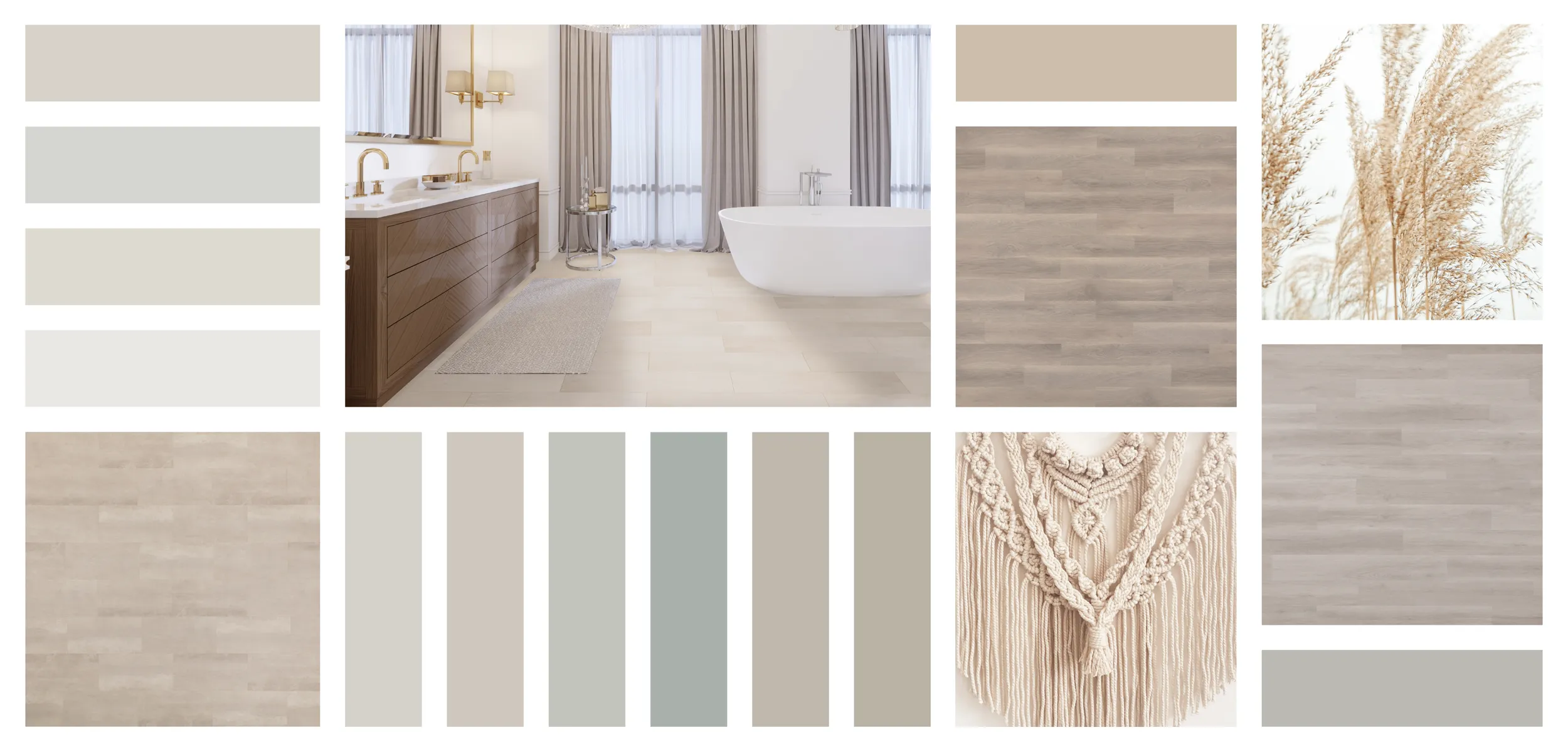
No. 4 is heavenly with its subtle yet diverse palette. These colors are delicate and ethereal, creating a peaceful paradise anywhere.
For No. 4 Delicate Tints, we recommend these pairings…
Astella – Sound-Tec Tile 9608
Was that a shooting star? As if pulled from the starry sky night, Astella expands across space with its luminous essence. With its very low variation, this design is an extremely smooth and vivid visual odyssey.
Bristol Harbor – Studio 12 GlueDown 2107 and Floating Floor 2907
You can almost see a ship coming into harbor. The lightest of the Studio 12 collection, Bristol Harbor is cozy yet chic, suggesting rolling fog and smoky chimneys. The slight, warm undertones suggest sunlight breaking through.
Whispering Pines – Studio 12 GlueDown 2108 and Floating Floor 2908
The whispering of a zephyr passing through a dense forest. Whispering Pines decorates a floor with the shades of aging pine bark and the feathers of a great gray owl. This design is the secret to balanced beauty.
Volume Two
We’re excited to see what Sherwin-Williams will assemble for their collection of palettes, Anthology: Volume Two. If you’re ready to incorporate these stunning pairings into your spaces, contact your Urban Surfaces representative today.

- The Advantages of Standardizing Your Flooring Specs With Urban Surfaces - February 12, 2025
- Urban Surfaces: Your Partner in Solving Multifamily Flooring Challenges - January 3, 2025
- Record-Smashing 12-Second Floor Plank Replacement With Traction + InstaGrip - September 26, 2024
